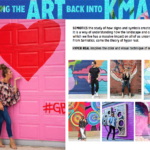
When designing the new look and feel of channel agnostic content for Kmart, a SEMIOTICS filter was used to amplify signs and symbols to create meaning.
This was a way of understanding how visuals and music has a massive impact on all of us unconsciously. From Semiotics, came the theory of the HYPER REAL which inspired the colour and visual technique of the branded content.
The brand needed a vibrant, youthful and energetic personality so the creative could stand out in the marketplace with movement, texture and a modern design aesthetic.
MOMENTS, SLICES and TEXTURE were used to create a visual humour with improv and candid performance at its core. The images were all set to a DJ remixed version of the “Din Da Da” track.


What a great post! Thank you for writing
Spot on with this write-up, I truly think this website needs much more consideration. I?ll probably be again to read much more, thanks for that info.
I loved your blog. Keep writing.